4 交互图形
在之前的数据探索章节介绍了 ggplot2 包,本章将介绍 plotly 包,绘制交互图形,包含基础元素、常用图形和技巧,沿用日志提交数据和 Base R 内置的斐济及周边地震数据。写作上,仍然以一个数据串联尽可能多的小节,从 ggplot2 包到 plotly 包,将介绍其间的诸多联系,以便读者轻松掌握。
4.1 基础元素
4.1.1 图层
plotly 包封装了许多图层函数,可以绘制各种各样的统计图形,见下 表 4.1 。
| add_annotations | add_histogram | add_polygons |
| add_area | add_histogram2d | add_ribbons |
| add_bars | add_histogram2dcontour | add_scattergeo |
| add_boxplot | add_image | add_segments |
| add_choropleth | add_lines | add_sf |
| add_contour | add_markers | add_surface |
| add_data | add_mesh | add_table |
| add_fun | add_paths | add_text |
| add_heatmap | add_pie | add_trace |
下面以散点图为例,使用方式非常类似 ggplot2 包,函数 plot_ly() 类似 ggplot(),而函数 add_markers() 类似 geom_point(),效果如 图 4.1 所示。
或者使用函数 add_trace(),层层添加图形元素,效果和上 图 4.1 是一样的。
4.1.2 配色
在 图 4.1 的基础上,将颜色映射到震级变量上。
4.1.3 刻度
东经和南纬
4.1.4 标签
添加横轴、纵轴以及主副标题
4.1.5 主题
plotly 内置了一些主题风格
4.1.6 字体
4.1.7 图例
4.2 常用图形
4.2.1 散点图
plotly 包支持绘制许多常见的散点图,从直角坐标系 scatter 到极坐标系 scatterpolar 和地理坐标系 scattergeo,从二维平面 scatter 到三维空间 scatter3d,借助 WebGL 可以渲染大规模的数据点 scattergl。
| 类型 | 名称 |
|---|---|
scatter |
二维平面散点图 |
scatter3d |
三维立体散点图 |
scattergl |
散点图(WebGL 版) |
scatterpolar |
极坐标下散点图 |
scatterpolargl |
极坐标下散点图(WebGL 版) |
scattergeo |
地理坐标下散点图 |
scattermapbox |
地理坐标下散点图(MapBox 版) |
scattercarpet |
地毯图 |
scatterternary |
三元图 |
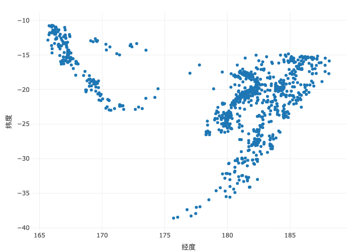
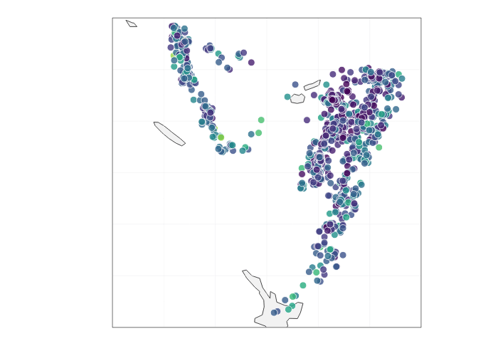
图 4.6 展示斐济及其周边的地震分布
4.2.2 柱形图
4.2.3 曲线图
4.2.4 直方图
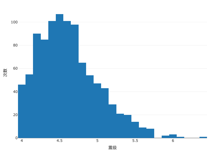
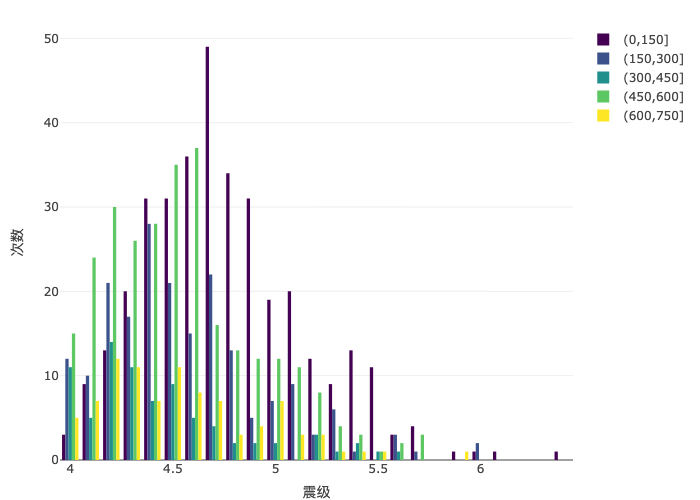
地震次数随震级的分布变化,下 图 4.9 为频数分布图
地震震级的概率分布,下 图 4.10 为频率分布图
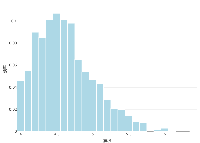
histnorm = "probability" 意味着纵轴表示频率,即每个窗宽下地震次数占总地震次数的比例。地震常常发生在地下,不同的深度对应着不同的地质构造、不同的地震成因,下 图 4.11 展示海平面下不同深度的地震震级分布。
4.2.5 箱线图
4.2.6 热力图
plotly 整合了开源的 Mapbox GL JS,可以使用 Mapbox 提供的瓦片地图服务(Mapbox Tile Maps),对空间点数据做核密度估计,展示热力分布,如 图 4.14 所示。图左上角为所罗门群岛(Solomon Islands)、瓦努阿图(Vanuatu)和新喀里多尼亚(New Caledonia),图下方为新西兰北部的威灵顿(Wellington)和奥克兰(Auckland),图中部为斐济(Fiji)。
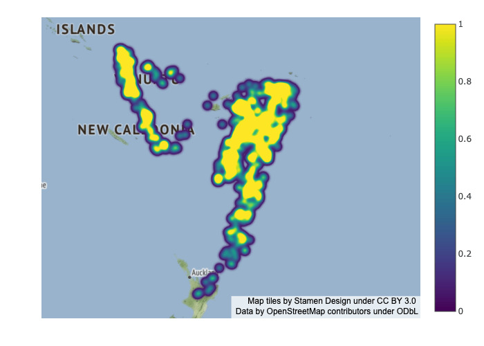
图中设置瓦片地图的风格 style 为 "stamen-terrain",还可以使用其他开放的栅格瓦片地图服务,比如 "open-street-map" 和 "carto-positron"。如果使用 MapBox 提供的矢量瓦片地图服务,则需要访问令牌 Mapbox Access Token。图中设置中心坐标 center 以及缩放倍数 zoom,目的是突出图片中的数据区域。设置调色板 Viridis 展示热力分布,黄色团块的地方表示地震频次高。
4.2.7 面量图
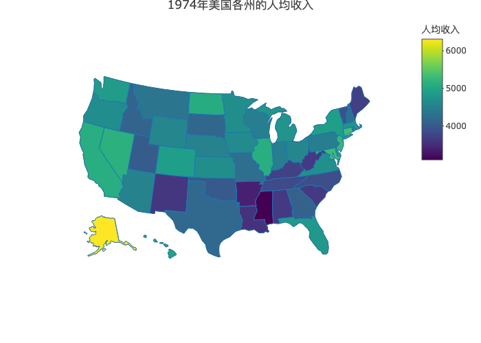
在之前我们介绍过用 ggplot2 绘制地区分布图,实际上,地区分布图还有别名,如围栏图、面量图等。本节使用 plotly 绘制交互式的地区分布图,如 图 4.15 所示。
# https://plotly.com/r/reference/choropleth/
dat <- data.frame(state.x77,
  stats = rownames(state.x77),
  stats_abbr = state.abb
)
# 绘制图形
plotly::plot_ly(
  data = dat,
  type = "choropleth",
  locations = ~stats_abbr,
  locationmode = "USA-states",
  colorscale = "Viridis",
  colorbar = list(title = list(text = "人均收入")),
  z = ~Income
) |>
  plotly::layout(
    geo = list(scope = "usa"),
    title = "1974年美国各州的人均收入"
  )
4.2.8 动态图
本节参考 plotly 包的官方示例渐变动画,数据来自 SVN 代码提交日志,统计 Martin Maechler 和 Brian Ripley 的年度代码提交量,他们是 R Core Team 非常重要的两位成员,长期参与维护 R 软件及社区。下图展示 1999-2022 年 Martin Maechler 和 Brian Ripley 的代码提交量变化。
# https://plotly.com/r/animations/
trunk_year_author <- aggregate(data = svn_trunk_log, revision ~ year + author, FUN = length)
# https://plotly.com/r/cumulative-animations/
accumulate_by <- function(dat, var) {
  var <- lazyeval::f_eval(f = var, data = dat)
  lvls <- plotly:::getLevels(var)
  dats <- lapply(seq_along(lvls), function(x) {
    cbind(dat[var %in% lvls[seq(1, x)], ], frame = lvls[[x]])
  })
  dplyr::bind_rows(dats)
}

subset(trunk_year_author, year >= 1999 & author %in% c("ripley", "maechler")) |>
  accumulate_by(~year) |>
  plotly::plot_ly(
    x = ~year, y = ~revision, split = ~author,
    frame = ~frame, type = "scatter", mode = "lines",
    line = list(simplyfy = F)
  ) |>
  plotly::layout(
    xaxis = list(title = "年份"),
    yaxis = list(title = "代码提交量")
  ) |>
  plotly::animation_opts(
    frame = 100, transition = 0, redraw = FALSE
  ) |>
  plotly::animation_button(
    visible = TRUE, # 显示播放按钮
    label = "播放", # 按钮文本
    font = list(color = "gray")# 文本颜色
  ) |>
  plotly::animation_slider(
    currentvalue = list(
      prefix = "年份 ",
      xanchor = "right",
      font = list(color = "gray", size = 30)
    )
)4.3 常用技巧
4.3.1 数学公式
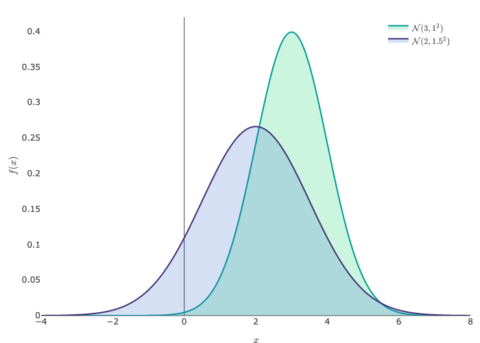
正态分布的概率密度函数形式如下:
\[ \begin{aligned} & f(x;\mu,\sigma^2) = \frac{1}{\sqrt{2\pi}\sigma}\exp\{-\frac{(x -\mu)^2}{2\sigma^2}\} \end{aligned} \]
下图展示两个正态分布,分别是 \(\mathcal{N}(3, 1^2)\) 和 \(\mathcal{N}(2, 1.5^2)\) 。函数 plotly::TeX() 包裹 LaTeX 书写的数学公式,plotly 包调用 MathJax 库渲染图中的公式符号。
代码
x <- seq(from = -4, to = 8, length.out = 193)
y1 <- dnorm(x, mean = 3, sd = 1)
y2 <- dnorm(x, mean = 2, sd = 1.5)

plotly::plot_ly(
  x = x, y = y1, type = "scatter", mode = "lines",
  fill = "tozeroy", fillcolor = "rgba(0, 204, 102, 0.2)",
  text = ~ paste0(
    "x:", x, "<br>",
    "y:", round(y1, 3), "<br>"
  ),
  hoverinfo = "text",
  name = plotly::TeX("\\mathcal{N}(3,1^2)"),
  line = list(shape = "spline", color = "#009B95")
) |>
  plotly::add_trace(
    x = x, y = y2, type = "scatter", mode = "lines",
    fill = "tozeroy", fillcolor = "rgba(51, 102, 204, 0.2)",
    text = ~ paste0(
      "x:", x, "<br>",
      "y:", round(y2, 3), "<br>"
    ),
    hoverinfo = "text",
    name = plotly::TeX("\\mathcal{N}(2, 1.5^2)"),
    line = list(shape = "spline", color = "#403173")
  ) |>
  plotly::layout(
    xaxis = list(showgrid = F, title = plotly::TeX("x")),
    yaxis = list(showgrid = F, title = plotly::TeX("f(x)")),
    legend = list(x = 0.8, y = 1, orientation = "v")
  ) |>
plotly::config(mathjax = "cdn", displayModeBar = FALSE)4.3.2 动静转化
在出版书籍,发表期刊文章,打印纸质文稿等场景中,需要将交互图形导出为静态图形,再插入到正文之中。
将 ggplot2 包绘制的散点图转化为交互式的散点图,只需调用 plotly 包的函数 ggplotly()。
当使用配置函数 config() 设置参数选项 staticPlot = TRUE,可将原本交互式的动态图形转为非交互式的静态图形。
orca (Open-source Report Creator App) 软件针对 plotly.js 库渲染的图形具有很强的导出功能,安装 orca 后,plotly::orca() 函数可以将基于 htmlwidgets 的 plotly 图形对象导出为 PNG、PDF 和 SVG 等格式的高质量静态图片。
4.3.3 坐标系统
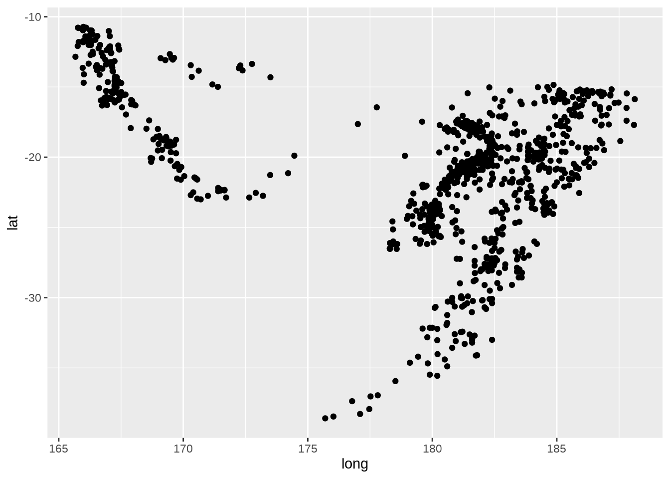
quakes 是一个包含空间位置的数据集,plotly 的 scattergeo 图层 针对空间数据提供多边形矢量边界地图数据,支持设定坐标参考系。下 图 4.19 增加了地震震级维度,在空间坐标参考系下绘制散点。
plotly::plot_ly(
  data = quakes,
  lon = ~long, lat = ~lat,
  type = "scattergeo", mode = "markers",
  text = ~ paste0(
    "站点:", stations, "<br>",
    "震级:", mag
  ),
  marker = list(
    color = ~mag, colorscale = "Viridis",
    size = 10, opacity = 0.8,
    line = list(color = "white", width = 1)
  )
) |>
  plotly::layout(geo = list(
    showland = TRUE,
    landcolor = plotly::toRGB("gray95"),
    countrycolor = plotly::toRGB("gray85"),
    subunitcolor = plotly::toRGB("gray85"),
    countrywidth = 0.5,
    subunitwidth = 0.5,
    lonaxis = list(
      showgrid = TRUE,
      gridwidth = 0.5,
      range = c(160, 190),
      dtick = 5
    ),
    lataxis = list(
      showgrid = TRUE,
      gridwidth = 0.5,
      range = c(-40, -10),
      dtick = 5
    )
  ))
4.3.4 添加水印
在图片右下角添加水印图片
plotly::plot_ly(quakes,
  x = ~long, y = ~lat, color = ~mag,
  type = "scatter", mode = "markers"
) |>
  plotly::config(staticPlot = TRUE) |>
  plotly::layout(
    images = list( # 水印图片
      source = "https://images.plot.ly/language-icons/api-home/r-logo.png",
      xref = "paper", # 页面参考
      yref = "paper",
      x = 0.90, # 横坐标
      y = 0.20, # 纵坐标
      sizex = 0.2, # 长度
      sizey = 0.2, # 宽度
      opacity = 0.5 # 透明度
    )
)4.3.5 多图布局
将两个图形做上下排列
p1 <- plotly::plot_ly(
  data = trunk_year, x = ~year, y = ~revision, type = "bar"
) |>
  plotly::layout(
    xaxis = list(title = "年份"),
    yaxis = list(title = "代码提交量")
  )

p2 <- plotly::plot_ly(
  data = trunk_year, x = ~year, y = ~revision, type = "scatter",
  mode = "markers+lines", line = list(shape = "spline")
) |>
  plotly::layout(
    xaxis = list(title = "年份"),
    yaxis = list(title = "代码提交量")
  )

htmltools::tagList(p1, p2)plotly 包提供的函数 subplot() 专门用于布局排列,下图的上下子图共享 x 轴。
下图展示更加灵活的布局形式,嵌套使用布局函数 subplot() 实现。
4.3.6 图表联动
crosstalk 包可将 plotly 包绘制的图形和 DT 包制作的表格联动起来。plotly 绘制交互图形,在图形上用套索工具筛选出来的数据显示在表格中。
library(crosstalk)
# quakes 数据变成可共享的
quakes_sd <- SharedData$new(quakes)
# 绘制交互图形
p <- plotly::plot_ly(quakes_sd, x = ~long, y = ~lat) |>
  plotly::add_markers() |>
  plotly::highlight(on = "plotly_selected", off = "plotly_deselect")
# 制作表格
d <- DT::datatable(quakes_sd, options = list(dom = "tp"))
# 将图表组合一起展示
bscols(list(p, d))